New Blog, Who Dis?
Time to read: 10 min read
# Why Blog?
Writing has always been very meditative for me, therapeutic even. It helps me collect and organize my thoughts and it furthers my understanding of a topic by forcing me to articulate the concepts. In the past I have written mostly for myself, often deleting paragraphs after I write them. I found that the ephemeral quality of such writing kept my ideas authentic by freeing me from inhibitions such as worrying about what others may think. Despite this, many of my friends have urged me to publish what I write as it may bring value to others. This is my hope for my writing; I will try to be as authentic as possible and I hope that what I write will bring value to you, if only in offering a different perspective.
TIP
An ephemeris is an instrument used to map the stars. It has been used since the time of the ancient Greeks and it's still in use today (albeit in electronic form). I chose this as the title of my blog for two reasons. The first reason is that the etymology of the term is from both Latin and Greek and it roughly translates to "diary" or "journal"; I thought this was appropriate as I intend to write more frequently. The second reason is that I believe knowledge is cumulative and exponential, with the whole worth more than the sum of the parts. I often visualize learning as weaving a tapestry, with different pieces of knowledge interconnecting to form a grand picture or design. What's a more grand and more beautiful tapestry than the stars?
# Building My Own Blog
Having decided to publish what I write, I had to find a good medium. I found publishing on pre-existing websites such as Twitter and Medium too restrictive, both in content (format and word count) and audience (having to be a member or having to pay). Thus began my journey into building my own blog. It has been a trial and error process; this is the second iteration of my attempts at building a website (third iteration if you count learning Dreamweaver in the one computer class I took in high school). I learned a great deal about how powerful web development can be and made many mistakes along the way. I hope to share some of my insights on my journey to building a publishing medium. I'm by no means an expert web designer/developer (in fact most of my programming experience is in traditional SWE and data science); these are just some of the observations I made when building my own blog.
# My Old Blog
# Homepage
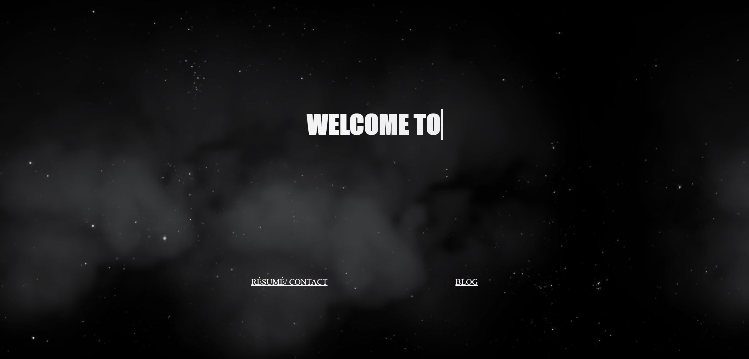
I knew that HTML and CSS are fundamental skills in any web developer's repertoire, so one of the first pages I created was my landing page, using only HTML and CSS. I was amazed at the versatility and capability of using only HTML and CSS and I went a little crazy with the animations. My home page had twinkling stars, moving clouds, and even a typewriter effect for text. Check it out here.
WARNING
Having animations can be a nice touch, but in most cases, the content of the page should be the focus. Form should follow function; I do not think it's generally a good idea to have a webpage solely for form. In hindsight it was overwhelming and a little tacky to have so many animations on one page, especially one with so little content.

# Blog Intro Page
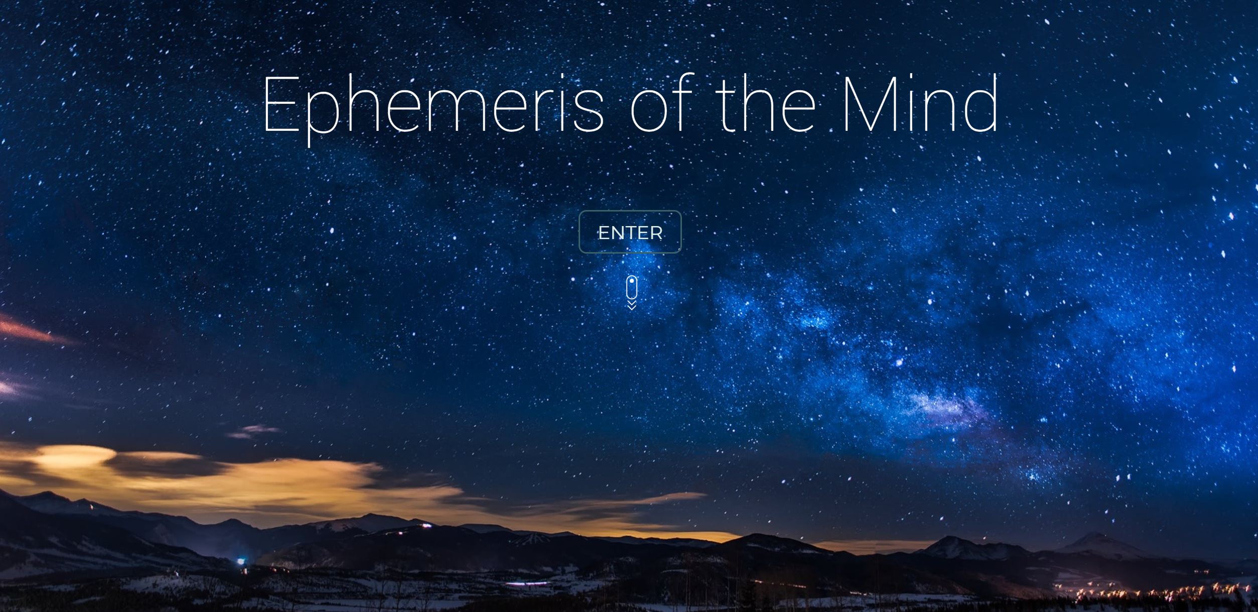
Another page I built for my website is a landing page for my blog. I was playing around with more responsive web design in jQuery. The website had a very smooth animation with the letters sliding up and bouncing a bit once the page has loaded. Check it out here; the animation may not load.
WARNING
The animation on this page was tasteful and the design was responsive and adapted to different screen sizes, however, this page did not accomplish much in terms of function. I try to use the "3-Click Rule", meaning a person visiting your website should find what they're looking for within 3 clicks. Having this page used up a click for no benefit in return.

# Timeline
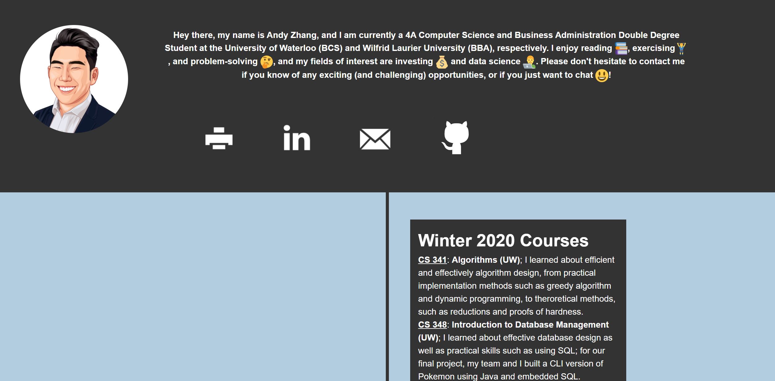
I wanted to make a creative "About Me" page, so I decided to make it a timeline of my life. I used some HTML and CSS and I was actually using it up until very recently. Check it out here.
WARNING
The timeline was decent, but one thing I did not like was that there was too much text in each entry. Reading through them can get tedious, especially with a smaller and more dense textbox. I had time to remake a new version with more images to break up the text. Check it out here.

# Blog
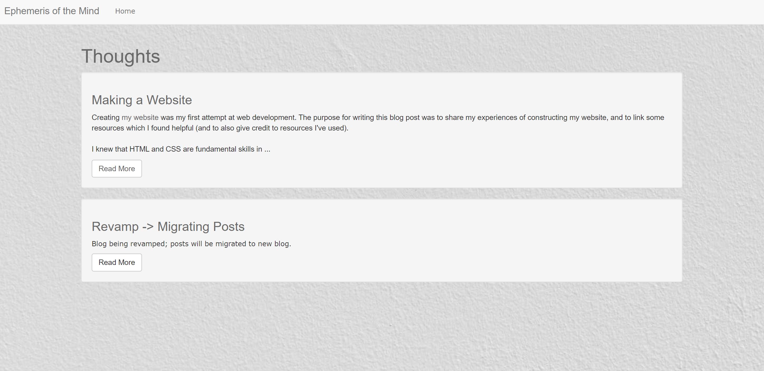
The next page I built was my actual blog. I decided to make my blog dynamic and spent hours figuring how different parts of Ruby on Rails such as scaffolding worked. There were many gems which added extra features, such as Trix for text editing. I hosted with Heroku. Check it out here; it may take a while to load the first time and the links aren't updated.
WARNING
I didn't really benefit from allowing the additional interactions between the site and the server/database. In fact, I often had to work around the quirks of a dynamic website, such as creating user authentication so that only I can log-in and add pages. Hosting a dynamic website is also relatively expensive (as most static websites can be hosted for free) and the free options lack in performance (very, very slow to load). I would recommend making a personal site staticly, unless you would like to learn about dynamic web design frameworks.

# Very Short Reviews
I built a page to write very short reviews (in one line of less). I built this page dynamically as well, using Ruby on Rails. Due to the page having multimedia assets such as images, I had to pipeline all storage to Amazon S3. Check it out here; it may take a while to load the first time and the images may be gone.
WARNING
Building this site really illustrated for me how deep dynamic website design can go. I had to learn about many small and niche aspects of a webpage design that I had never even thought of before, such as inheritance between different scaffolds. Formatting was also very fickle, as I had to consider both the front and back-end when making changes to templates. Since I was using Heroku to host, the multimedia assets were not saved after each posting; I had to pipeline everything to Amazon S3; this would not have been an issue with a static website. The key takeaway is to be prepared to commit time to build a functional dynamic website.

# New Blog
You are reading my new blog! I built it off of BenCodeZen's Vuepress template. Vuepress is a static site generator built by the same developers behind Vue.js. It's easy to set up and get running and it's also not overly technical so it's very accessible for beginners. It makes use of Markdown, which is very clean aesthetically. Although it may not have as many functions as some of my previous sites, I am very happy with how everything turned out; it was a good return for the amount of time I put in.
# Hosting
I'm currently hosting my main website (the one you're reading now) on Netlify from my Github. I really like how my site updates whenever changes are pushed to my repository. I'm using Namecheap for my domain name. The customer support for Namecheap has been fantastic, but one small issue is the inability have different subdomains if you are using a custom DNS configuration for your main domain, which is mildly infuriating.
# 3 Key Takeaways for Building a Blog/Site
I do not regret spending all the time fumbling around and experimenting with different frameworks and designs, as it has made me a better designer and programmer. There were, however, some advices that I wish I knew of before building these sites and I hope that by sharing these advices, I can help you avoid the same mistakes and pitfalls that I fell for.
# Keep Things Simple, Stupid
The era of colourful GeoCities is over (this reference was a bit before my time, but looking through the archives, there were some pretty cool subcultures); good, tasteful web design today values simplicity and function. I personally think a clean webpage is much more aesthetically pleasing than one with many colours/features. The KISS principle will save you time, as you won't have to make the unwanted features and you won't have to delete them when your friends let you know how tacky they look.
# Build What You Need
Figure out what you want your project to accomplish before you even start drafting designs for your site. Avoid building in features just because you can (unless your main objective is learning). Especially for personal sites, really consider whether you need to make a dynamic website or a static website. Dynamic websites will take you much longer as it's much more learning and labour intensive to create. It is ultimately up to you and your objectives. If you're building a site to learn about web development then I would actually recommend trying to build a dynamic website, as you will be forced to learn about all the pipelines and structures behind most major websites today. If your goal is to just have a functional blog/portfolio website, building a static site is often more than sufficient, and will probably be the best use of your time.
# Don't Reinvent the Wheel
There are quite literally tens of thousands of resources on building websites online. In most cases, someone probably already built a version of what you had in mind for your website (or atleast a very close version to what you have in mind). This means that in most cases, you don't have to build websites/features from scratch. If your goal is to just have a nice, functional product, then you can probably skip a lot of the DIY and build off of other people's work (check the license first, though, and give credit where it's due). This will save you a lot of time, especially at the beginning, when you are beginning to get comfortable with different web development concepts.
# Conclusion
My final bit of advise is to just get started. Even if you're a beginner and have never coded before, web development is perhaps one of the most beginner-friendly subdomain in programming, as you have a visual feedback to what you're coding. I felt that going through this journey of building a functional blog has taught me a great deal about coding and design; it has made me a more well-rounded programmer. I hope this article can help you plan and navigate the process of building your own website.
I hope you build something cool.